
2416 words
12 minutes
CSS Complete Guide - Master Styling
🎨 CSS Complete Guide - Master Styling
📚 Table of Contents
- What is CSS?
- How to Add CSS
- Selectors
- Colors
- Backgrounds
- Text Styling
- Fonts
- Box Model
- Borders
- Margins and Padding
- Width and Height
- Display Property
- Position
- Flexbox
- CSS Grid
- Transitions
- Animations
- Transforms
- Responsive Design
- Pseudo-classes
- Pseudo-elements
- Variables (Custom Properties)
- Best Practices
- Complete Examples
1. What is CSS?
CSS = Cascading Style Sheets
CSS controls how HTML elements look on screen.
CSS Syntax
selector { property: value; property: value;}Example
h1 { color: blue; font-size: 24px;}2. How to Add CSS
Inline CSS (in HTML tag)
<p style="color: red; font-size: 16px;">Red text</p>Internal CSS (in <head>)
<head> <style> p { color: blue; } </style></head>External CSS (separate file) ⭐ Best
<head> <link rel="stylesheet" href="styles.css"></head>p { color: green;}3. Selectors
Basic Selectors
/* Element selector */p { color: blue; }
/* Class selector (.) */.highlight { background: yellow; }
/* ID selector (#) */#header { height: 80px; }
/* Universal selector (*) */* { margin: 0; padding: 0; }Combining Selectors
/* Multiple elements */h1, h2, h3 { color: navy; }
/* Descendant (any level) */div p { color: red; }
/* Child (direct only) */div > p { color: blue; }
/* Adjacent sibling */h1 + p { margin-top: 0; }
/* General sibling */h1 ~ p { color: gray; }Attribute Selectors
/* Has attribute */[disabled] { opacity: 0.5; }
/* Exact value */[type="text"] { border: 1px solid gray; }
/* Contains value */[class*="btn"] { cursor: pointer; }
/* Starts with */[href^="https"] { color: green; }
/* Ends with */[href$=".pdf"] { color: red; }Selector Specificity
Inline styles: 1000ID: 100Class/attribute: 10Element: 14. Colors
Color Formats
/* Named colors */color: red;color: blue;color: darkgreen;
/* Hexadecimal */color: #ff0000; /* Red */color: #00ff00; /* Green */color: #0000ff; /* Blue */color: #fff; /* Short: white */
/* RGB */color: rgb(255, 0, 0); /* Red */color: rgb(0, 255, 0); /* Green */
/* RGBA (with transparency) */color: rgba(255, 0, 0, 0.5); /* 50% transparent red */
/* HSL */color: hsl(0, 100%, 50%); /* Red */color: hsl(120, 100%, 50%); /* Green */
/* HSLA */color: hsla(0, 100%, 50%, 0.5);Common Colors
| Color | Hex | RGB |
|---|---|---|
| Black | #000000 | rgb(0,0,0) |
| White | #ffffff | rgb(255,255,255) |
| Red | #ff0000 | rgb(255,0,0) |
| Green | #00ff00 | rgb(0,255,0) |
| Blue | #0000ff | rgb(0,0,255) |
5. Backgrounds
/* Background color */background-color: #f0f0f0;
/* Background image */background-image: url('image.jpg');
/* Background repeat */background-repeat: no-repeat; /* repeat, repeat-x, repeat-y */
/* Background position */background-position: center center; /* top, bottom, left, right */
/* Background size */background-size: cover; /* contain, 100%, 200px 100px */
/* Background attachment */background-attachment: fixed; /* scroll */
/* Shorthand */background: #f0f0f0 url('image.jpg') no-repeat center/cover;
/* Multiple backgrounds */background: url('top.png') no-repeat top, url('bottom.png') no-repeat bottom, #ffffff;
/* Gradient */background: linear-gradient(to right, red, blue);background: linear-gradient(45deg, #ff0000, #0000ff);background: radial-gradient(circle, red, blue);6. Text Styling
/* Color */color: #333;
/* Alignment */text-align: left; /* right, center, justify */
/* Decoration */text-decoration: none; /* Remove underline */text-decoration: underline;text-decoration: line-through;text-decoration: overline;
/* Transform */text-transform: uppercase;text-transform: lowercase;text-transform: capitalize;
/* Spacing */letter-spacing: 2px;word-spacing: 5px;line-height: 1.5;
/* Indent */text-indent: 50px;
/* Shadow */text-shadow: 2px 2px 4px rgba(0,0,0,0.5);
/* Overflow */white-space: nowrap;overflow: hidden;text-overflow: ellipsis; /* Shows "..." */7. Fonts
Font Properties
/* Font family */font-family: Arial, Helvetica, sans-serif;font-family: 'Times New Roman', serif;font-family: 'Courier New', monospace;
/* Font size */font-size: 16px;font-size: 1rem;font-size: 1.5em;
/* Font weight */font-weight: normal; /* 400 */font-weight: bold; /* 700 */font-weight: 100; /* Thin */font-weight: 900; /* Black */
/* Font style */font-style: normal;font-style: italic;font-style: oblique;
/* Shorthand */font: italic bold 16px/1.5 Arial, sans-serif;Google Fonts
<head> <link href="https://fonts.googleapis.com/css2?family=Roboto:wght@400;700&display=swap" rel="stylesheet"></head>body { font-family: 'Roboto', sans-serif;}Custom Fonts
@font-face { font-family: 'MyFont'; src: url('myfont.woff2') format('woff2'), url('myfont.woff') format('woff'); font-weight: normal; font-style: normal;}
body { font-family: 'MyFont', sans-serif;}8. Box Model
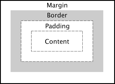
Every element is a box with:
- Content - The actual content
- Padding - Space inside the border
- Border - The border
- Margin - Space outside the border
.box { /* Content size */ width: 200px; height: 100px;
/* Padding (inside) */ padding: 20px;
/* Border */ border: 2px solid black;
/* Margin (outside) */ margin: 10px;}
/* Box-sizing (include padding/border in width) */* { box-sizing: border-box; /* Recommended! */}9. Borders
/* Border shorthand */border: 1px solid black;
/* Individual sides */border-top: 2px dashed red;border-right: 3px dotted blue;border-bottom: 1px solid green;border-left: none;
/* Border width */border-width: 1px 2px 3px 4px; /* top right bottom left */
/* Border style */border-style: solid; /* dotted, dashed, double, groove, ridge, inset, outset */
/* Border color */border-color: red;
/* Border radius (rounded corners) */border-radius: 10px;border-radius: 50%; /* Circle */border-radius: 10px 20px; /* top-left/bottom-right, top-right/bottom-left */border-radius: 10px 20px 30px 40px;
/* Individual corners */border-top-left-radius: 10px;border-top-right-radius: 20px;10. Margins and Padding
/* All sides */margin: 20px;padding: 20px;
/* Vertical | Horizontal */margin: 10px 20px;padding: 10px 20px;
/* Top | Horizontal | Bottom */margin: 10px 20px 30px;
/* Top | Right | Bottom | Left (clockwise) */margin: 10px 20px 30px 40px;padding: 10px 20px 30px 40px;
/* Individual sides */margin-top: 10px;margin-right: 20px;margin-bottom: 30px;margin-left: 40px;
padding-top: 10px;padding-right: 20px;padding-bottom: 30px;padding-left: 40px;
/* Auto (center horizontally) */margin: 0 auto;11. Width and Height
/* Fixed size */width: 200px;height: 100px;
/* Percentage */width: 50%;height: 100%;
/* Viewport units */width: 100vw; /* 100% viewport width */height: 100vh; /* 100% viewport height */
/* Min/Max */min-width: 200px;max-width: 800px;min-height: 100px;max-height: 500px;
/* Auto */width: auto;height: auto;
/* Fit content */width: fit-content;12. Display Property
/* Block - takes full width */display: block;
/* Inline - flows with text */display: inline;
/* Inline-block - inline but accepts width/height */display: inline-block;
/* None - hidden */display: none;
/* Flex - flexbox layout */display: flex;
/* Grid - grid layout */display: grid;
/* Hide but keep space */visibility: hidden;13. Position
/* Static (default) - normal flow */position: static;
/* Relative - relative to normal position */position: relative;top: 10px;left: 20px;
/* Absolute - relative to nearest positioned ancestor */position: absolute;top: 0;right: 0;
/* Fixed - relative to viewport (stays on scroll) */position: fixed;bottom: 20px;right: 20px;
/* Sticky - switches between relative and fixed */position: sticky;top: 0;
/* Z-index (stacking order) */z-index: 100;Position Example
.parent { position: relative;}
.child { position: absolute; top: 50%; left: 50%; transform: translate(-50%, -50%); /* Center */}14. Flexbox

Container Properties
.container { display: flex;
/* Direction */ flex-direction: row; /* row-reverse, column, column-reverse */
/* Wrap */ flex-wrap: wrap; /* nowrap, wrap-reverse */
/* Justify (main axis) */ justify-content: center; /* flex-start, flex-end, space-between, space-around, space-evenly */
/* Align (cross axis) */ align-items: center; /* flex-start, flex-end, stretch, baseline */
/* Align multiple lines */ align-content: center; /* flex-start, flex-end, space-between, space-around */
/* Gap between items */ gap: 20px; row-gap: 10px; column-gap: 20px;}Item Properties
.item { /* Order */ order: 1;
/* Grow */ flex-grow: 1;
/* Shrink */ flex-shrink: 0;
/* Base size */ flex-basis: 200px;
/* Shorthand */ flex: 1 0 200px; /* grow shrink basis */
/* Individual alignment */ align-self: center;}Flexbox Examples
/* Center everything */.center { display: flex; justify-content: center; align-items: center;}
/* Space between */.navbar { display: flex; justify-content: space-between;}
/* Equal columns */.row { display: flex;}.column { flex: 1;}15. CSS Grid

Container Properties
.grid-container { display: grid;
/* Define columns */ grid-template-columns: 200px 200px 200px; grid-template-columns: 1fr 1fr 1fr; grid-template-columns: repeat(3, 1fr); grid-template-columns: repeat(auto-fit, minmax(200px, 1fr));
/* Define rows */ grid-template-rows: 100px 200px; grid-template-rows: auto;
/* Gap */ gap: 20px; row-gap: 10px; column-gap: 20px;
/* Alignment */ justify-items: center; /* start, end, stretch */ align-items: center;
/* Content alignment */ justify-content: center; align-content: center;}Item Properties
.grid-item { /* Span columns */ grid-column: 1 / 3; /* Start at 1, end at 3 */ grid-column: span 2; /* Span 2 columns */
/* Span rows */ grid-row: 1 / 3; grid-row: span 2;
/* Shorthand */ grid-area: 1 / 1 / 3 / 3; /* row-start / col-start / row-end / col-end */
/* Self alignment */ justify-self: center; align-self: center;}Grid Template Areas
.grid-container { display: grid; grid-template-columns: 200px 1fr 200px; grid-template-rows: auto 1fr auto; grid-template-areas: "header header header" "sidebar main aside" "footer footer footer";}
.header { grid-area: header; }.sidebar { grid-area: sidebar; }.main { grid-area: main; }.aside { grid-area: aside; }.footer { grid-area: footer; }16. Transitions
/* Transition property */transition-property: background-color;transition-duration: 0.3s;transition-timing-function: ease;transition-delay: 0s;
/* Shorthand */transition: background-color 0.3s ease;
/* Multiple properties */transition: background-color 0.3s, transform 0.5s;
/* All properties */transition: all 0.3s ease;
/* Timing functions */transition-timing-function: ease; /* default */transition-timing-function: linear;transition-timing-function: ease-in;transition-timing-function: ease-out;transition-timing-function: ease-in-out;transition-timing-function: cubic-bezier(0.25, 0.1, 0.25, 1);Transition Example
.button { background-color: blue; transform: scale(1); transition: all 0.3s ease;}
.button:hover { background-color: darkblue; transform: scale(1.1);}17. Animations
Keyframes
@keyframes slidein { from { transform: translateX(-100%); opacity: 0; } to { transform: translateX(0); opacity: 1; }}
@keyframes pulse { 0% { transform: scale(1); } 50% { transform: scale(1.1); } 100% { transform: scale(1); }}Animation Properties
.element { animation-name: slidein; animation-duration: 1s; animation-timing-function: ease; animation-delay: 0s; animation-iteration-count: 1; /* infinite */ animation-direction: normal; /* reverse, alternate, alternate-reverse */ animation-fill-mode: forwards; /* backwards, both */ animation-play-state: running; /* paused */
/* Shorthand */ animation: slidein 1s ease 0s 1 normal forwards;}
/* Multiple animations */.element { animation: slidein 1s ease, pulse 2s infinite;}Animation Example
@keyframes bounce { 0%, 100% { transform: translateY(0); } 50% { transform: translateY(-20px); }}
.ball { animation: bounce 0.5s ease infinite;}18. Transforms
/* Translate (move) */transform: translateX(50px);transform: translateY(100px);transform: translate(50px, 100px);
/* Rotate */transform: rotate(45deg);transform: rotateX(45deg);transform: rotateY(45deg);
/* Scale */transform: scale(1.5);transform: scaleX(2);transform: scaleY(0.5);transform: scale(2, 0.5);
/* Skew */transform: skewX(20deg);transform: skewY(20deg);transform: skew(20deg, 10deg);
/* Multiple transforms */transform: translate(50px, 100px) rotate(45deg) scale(1.5);
/* Transform origin */transform-origin: center center; /* default */transform-origin: top left;transform-origin: 50% 50%;
/* 3D transforms */transform: perspective(500px) rotateY(45deg);19. Responsive Design
Media Queries
/* Mobile first approach */.container { width: 100%;}
/* Tablet */@media (min-width: 768px) { .container { width: 750px; }}
/* Desktop */@media (min-width: 1024px) { .container { width: 960px; }}
/* Large desktop */@media (min-width: 1200px) { .container { width: 1140px; }}
/* Orientation */@media (orientation: landscape) { /* Landscape styles */}
/* Print */@media print { .no-print { display: none; }}Responsive Units
/* Relative to parent font-size */font-size: 1.5em;
/* Relative to root font-size */font-size: 1.5rem;
/* Viewport units */width: 100vw; /* viewport width */height: 100vh; /* viewport height */font-size: 5vw; /* 5% of viewport width */
/* Percentage */width: 50%;
/* Min/Max with clamp */font-size: clamp(1rem, 2vw, 2rem);width: clamp(200px, 50%, 800px);Responsive Images
img { max-width: 100%; height: auto;}20. Pseudo-classes
/* Link states */a:link { color: blue; }a:visited { color: purple; }a:hover { color: red; }a:active { color: orange; }
/* Focus */input:focus { border-color: blue; }
/* First/Last child */li:first-child { font-weight: bold; }li:last-child { border-bottom: none; }
/* Nth child */tr:nth-child(odd) { background: #f0f0f0; }tr:nth-child(even) { background: white; }tr:nth-child(3n) { /* Every 3rd */ }
/* Not selector */p:not(.special) { color: gray; }
/* Empty */div:empty { display: none; }
/* Enabled/Disabled */input:enabled { background: white; }input:disabled { background: gray; }
/* Checked */input:checked + label { font-weight: bold; }
/* Required/Optional */input:required { border-color: red; }input:optional { border-color: gray; }
/* Valid/Invalid */input:valid { border-color: green; }input:invalid { border-color: red; }21. Pseudo-elements
/* Before content */.quote::before { content: '"'; font-size: 2em;}
/* After content */.quote::after { content: '"'; font-size: 2em;}
/* First letter */p::first-letter { font-size: 2em; font-weight: bold;}
/* First line */p::first-line { font-weight: bold;}
/* Selection */::selection { background: yellow; color: black;}
/* Placeholder */input::placeholder { color: gray; font-style: italic;}
/* Marker (list bullet) */li::marker { color: red;}22. Variables (Custom Properties)
/* Define variables in :root */:root { --primary-color: #3498db; --secondary-color: #2ecc71; --font-size: 16px; --spacing: 20px; --border-radius: 8px;}
/* Use variables */.button { background-color: var(--primary-color); padding: var(--spacing); border-radius: var(--border-radius);}
/* Fallback value */color: var(--undefined-color, black);
/* Override in specific context */.dark-theme { --primary-color: #2980b9;}
/* Use in calculations */padding: calc(var(--spacing) * 2);23. Best Practices
Do’s ✅
/* Use meaningful class names */.navigation { }.btn-primary { }.card-header { }
/* Use shorthand */margin: 10px 20px;padding: 10px;
/* Use CSS variables */:root { --primary: blue; }
/* Mobile-first approach *//* Base styles for mobile, then media queries for larger */
/* Use box-sizing */* { box-sizing: border-box; }
/* Organize your CSS *//* 1. Reset 2. Variables 3. Base styles 4. Components 5. Utilities */Don’ts ❌
/* Don't use IDs for styling */#header { } /* Use .header instead */
/* Don't use !important */color: red !important;
/* Don't use inline styles */<div style="color: red;">
/* Don't use magic numbers */margin-top: 37px; /* Why 37? */24. Complete Examples
Card Component
.card { background: white; border-radius: 10px; box-shadow: 0 4px 6px rgba(0, 0, 0, 0.1); overflow: hidden; transition: transform 0.3s, box-shadow 0.3s;}
.card:hover { transform: translateY(-5px); box-shadow: 0 10px 20px rgba(0, 0, 0, 0.15);}
.card-image { width: 100%; height: 200px; object-fit: cover;}
.card-body { padding: 20px;}
.card-title { font-size: 1.25rem; font-weight: bold; margin-bottom: 10px;}
.card-text { color: #666; line-height: 1.6;}Button Styles
.btn { display: inline-block; padding: 12px 24px; font-size: 1rem; font-weight: 600; text-align: center; text-decoration: none; border: none; border-radius: 5px; cursor: pointer; transition: all 0.3s;}
.btn-primary { background: #3498db; color: white;}
.btn-primary:hover { background: #2980b9;}
.btn-outline { background: transparent; border: 2px solid #3498db; color: #3498db;}
.btn-outline:hover { background: #3498db; color: white;}Navigation Bar
.navbar { display: flex; justify-content: space-between; align-items: center; padding: 1rem 2rem; background: #333; position: sticky; top: 0; z-index: 1000;}
.navbar-brand { font-size: 1.5rem; font-weight: bold; color: white; text-decoration: none;}
.navbar-nav { display: flex; gap: 20px; list-style: none;}
.navbar-nav a { color: white; text-decoration: none; padding: 10px; transition: color 0.3s;}
.navbar-nav a:hover { color: #3498db;}
/* Mobile responsive */@media (max-width: 768px) { .navbar { flex-direction: column; } .navbar-nav { flex-direction: column; text-align: center; }}🎯 Quick Reference
| Property | Description |
|---|---|
color | Text color |
background | Background |
font-size | Text size |
margin | Outside spacing |
padding | Inside spacing |
border | Border |
display | Display type |
position | Position type |
flexbox | Flex layout |
grid | Grid layout |
Created by cat0x01 🥷🏻